I’ve used one transparent PNG-24 image and set the background of the image to different one. If you are a intermediate web developer or designer you might have already guessed what I mean. But if you are a newbie let me show you what and how I did it.
First created a new 150 X 50 px document in photoshop.
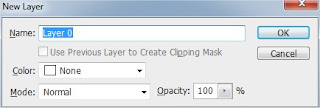
Then convert the locked Background Layer to normal layer by double clicking it.
Next, draw a rounded corner rectangle box. Give some gaps in all sides so that white part is still visible.
Select and right click on the Shape layer and choose Blending Options.
For now, only add Gradient Overlay to the shape. Choose and modify Black and White Gradient to Medium Grey and Dark Grey Gradient.
Now Rasterize the Layer.
Create a new text layer with the text message.
Control click on the T icon in the text layer, this will select the shape of text.
Without de-selecting, click on Layer 0, i.e.e Background layer and press Delete button. This will make hole in the white background.
Similarly select the shape layer and do same.
Now select the Text layer and delete it, as you don’t need it anymore.
Hold CTRL and click on the shape layer, this will make selection to the shape. In the same way as we did before, select Layer 0, i.e. white background layer and press Delete button.
Now change the Opacity of the shape layer to about 70%.
This will be final result.
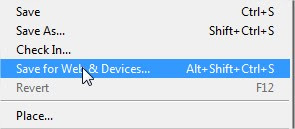
Save it for web with PNG-24 .
This will give you a transparent PNG image.
Since we are done with the button part, we have to add some CSS effect to make it look different. Create a simple hyperlink with this button image.
<a href="http://www.google.com"><img src="button.png" /></a>And define new class, button, to img tag.
<a href="http://www.google.com"><img src="button.png" class="button"/> </a>Now define the button CSS for it.
<style type="text/css">.button { background:#555;

}.button:hover { background:#3FC;}</style>
Initially the background is set to #555 which will result grey color, and when you hover your mouse over the button, the background color changes to #33FFCC. This will cause change in the transparent button and looks like more than one image is being used.
Certainly, this tutorial might helped or at least gave some new idea.
If you like this post, subscribe to our blog by filling up your email addres at the right side bar and click on Subscribe button. Also Bookmark us for interesting articles like these.


 Posted in
  Tags:
Tags: