 The beta version of Internet Explorer 9 was released 2 days ago in September 15 2010. There have been lots of reviews about the Internet Explorer 9. There are lots of good features added in Internet Explorer 9. The Developers Tools is very useful and the design is pleasing to eyes.
But I am not going to highlight all those good things about Internet Explorer nine. I’ll be pinpointing some major mistakes in this beta version of Internet Explorer 9. Since it’s in still in Beta mode, we must forgive IE for its several bad things. Here I am going to show you that I personally feel bad about Internet Explorer 9 Beta.
Placing of Tabs and Address bar
There is only one bar in Internet Explorer 9, The tools bar, tabs bar, and address bar are all merged in single bar. In the point of design view it looks amazing with bigger back button and smaller forward button.
But you’ll find it a bit problematic when you want to view the long URLs. You’ll have to use your mouse or keyboard keys to view the full URL.
Loading Notification
You can see a rotating icon on the most left of each tabs. It’s pleasing to eyes but as soon as it catches the title and favicon, it stops showing the loading icon and is replace by the favicon of the website.
 |
| Loading icon |
Since there is no other indicator to confirm that the site is still loading or fully loaded, you’ll be in dilemma.
Notification bar
We used to hate the pop-up notification at the header of the page in previous version of Internet Explorer. But we are going to miss lots of notification because IE9 Pop-ups a bar at the bottom of the page, which is most of the time remains un-noticed.
 |
| Pop-bar notification at the bottom of the page |
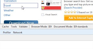
Inspecting elements has not developed yet
Though we can inspect element from Developers tools, IE9 does not have inspecting element feature for the selected item.
 |
| Inspecting elements using Developers Tools |


 Posted in
  Tags:
Tags: